Toglr

Many components. One function.

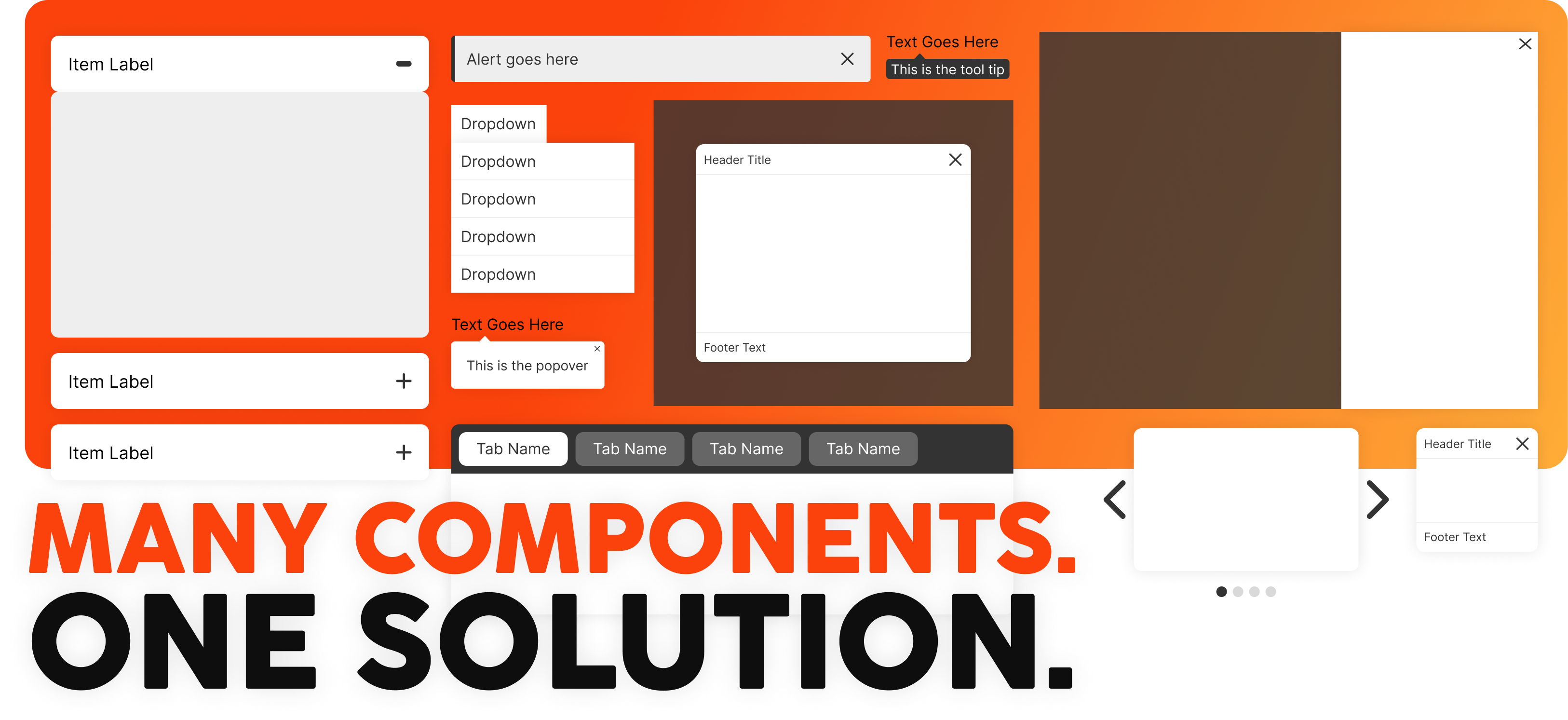
Many components share the common action of showing and hiding the infocus information. By creating a simple yet dynamic function, common and uncommon components can be built by using the same function and adjusting the CSS to get the desired functional outcome.

Download

How it works

Download the script and the base css file to start. Each components base css is named according to its matching component. You can use the styles as is or add your own modifications. Below is the function call that will allow you to apply settings for your components.

control

The basic structure of each item is identified with a specific class (.control) to trigger the matching items content to show.

group

The default state applies the group setting to the entire page but a group identifier can be applied by using the group setting to create multiples of the same component within a single page.

ITEM ITEM ITEM ITEM GROUP

closeAll

This setting will set all items to closed except the active item. This can be set to true to always have a single item in the group open or set to false to allow multiple items to be set to active at the same time.

addBody

This setting adds an active class to the body in case the component being used needs to make adjustments to the body when active.

direction

This setting adds the direction provided to the body.

full

This setting adds a class name of 'full' to the body in the case that the component needs an aditional setting to fill the screen.

actionType

This setting is used to adjust the action used to trigger the function. It works using jQuery syntax.

push

This setting adds a class name of 'push' to the body in the case that the component needs an aditional setting to push the body when active.

Additional Controls

Expand, Collapse, Next and Previous are controls that can be used based on the type of component being created. The data-nav and data-control values need to match.

NEXT ITEM PREVIOUS ITEM EXPAND ALL ITEMS COLLAPSE ALL ITEMS
Navigation Container:
data-nav="[group-control-name]"
Group Container:
data-control="[group-control-name]"

Example Components

Accordions

Vertical

Expand All Collapse All
text1
text1 content
text2
text2 content
text3
text3 content
text4
text4 content

Horizontal

text1
text1 content
text2
text2 content
text3
text3 content
text4
text4 content
Code:
$('.control').showhide('.accordion',true);

Tabs

Horizontal

text1 content
text2 content
text3 content

Vertical

text1 content
text2 content
text3 content
Code:
$('.control').showhide('.tabs',true);

Trays

text1
text1 content
Code:
$('.control').showhide('.tray');

Slider

text1 content
text2 content
text3 content
text4 content
text5 content
text6 content
Code:
$('.control').showhide('.slider',true);
Drop Down
Item 1 Item 2 Item 3 Item 4 Item 5
Drop Up
Item 1 Item 2 Item 3 Item 4 Item 5
Code:
$('.control').showhide('.drop',false,false,false,false);

Tooltip

pop left
text1 content
pop right
text1 content
pop top
text1 content
pop bottom
text1 content
Code:
$('.control').showhide('.tooltip',false,false,false,false,'mouseover mouseout');
Open Modal
Code:
$('.modal-control').showhide('body');

Popover

pop left
text1 content
pop right
text1 content
pop top
text1 content
pop bottom
text1 content
Code:
$('.control').showhide('.popover',false,false,false,false);

Edge Container

open1
menu1
open2
menu2
Code:
$('.edge-control').showhide('body',false,true,'bottom',false,'click',false);